 Yiwen
YiwenTriFold, Die Cut Brochure
Software: Indesign, Illustrator, Photoshop
For this assignment, I imaged that I created a nail art studio. I also want to do nail art as a sideline in real life, so I felt difficult to determine the name and the logo. In the end, I still felt unsatisfied with that. I will refine that in the future.
IMAGERY:
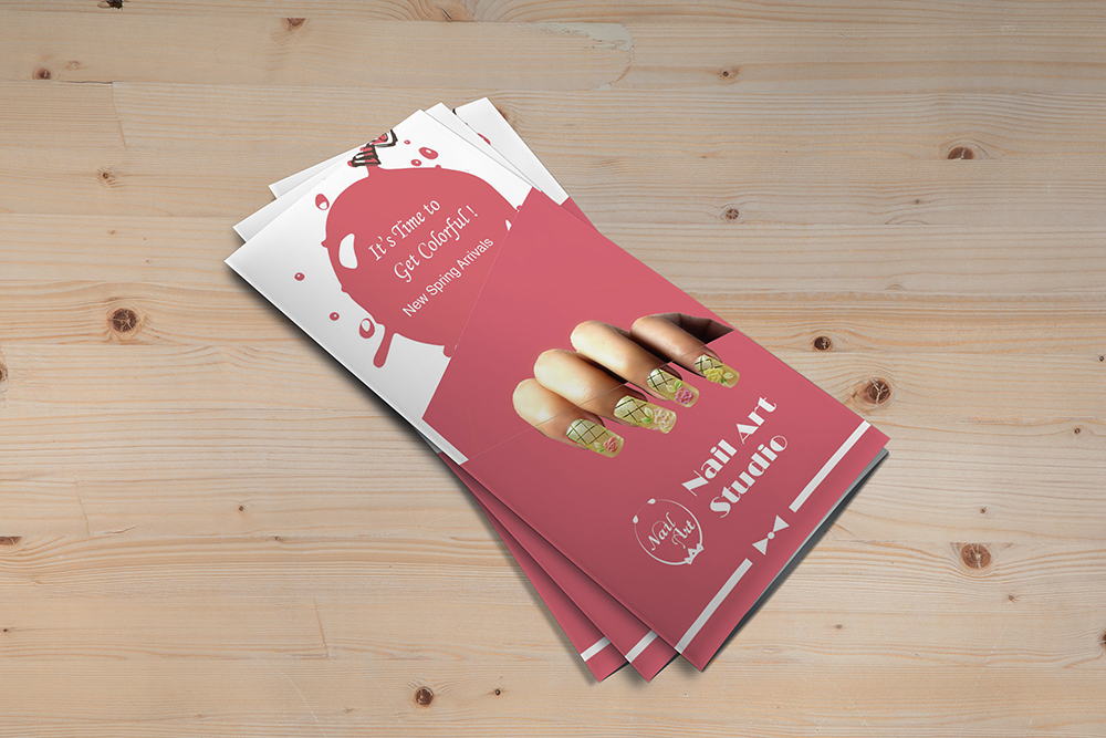
The main idea is when the brochure is unfolded, it looks like removing nail tips, yet when the brochure is folded, it seems to paste nail tips. Therefore, I made a finger die cut on the cover and preserved the nail tips which are one of my nail art works.
DESIGN ELEMENTS:
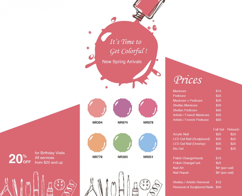
I used contrast font family and size to establish hierarchy and 9×5 grids layout. I also used tabs in the price and bulleted list in service hours.
The hardest part is the finger die line since the real fingers can’t align as tidy as my sketch. Ultimately, the final work meets my expectations.

Die Cut Brochure – outside
Die Cut Brochure
This post is one of my assignment from GDPW program at Humber College.
the original link:
TriFold, Die Cut Brochure
 Yiwen
Yiwen  Yiwen Wang
  Yiwen
Yiwen  Yiwen
Yiwen  Yiwen
Yiwen  Yiwen
Yiwen  Yiwen Wang
  Yiwen Wang
 Yiwen Wang
Leave a Reply
Want to join the discussion?Feel free to contribute!