Composite 2 – Album art + website
Software: Illustrator, Photoshop, InDesign, Sublime
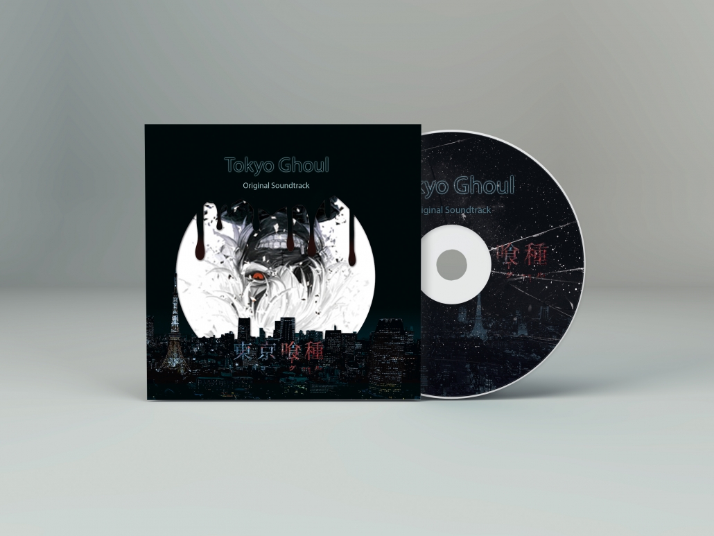
The album I chose for my project is Tokyo Ghoul Original Soundtrack since I rarely listen to other kinds of music but animation songs. Tokyo Ghoul is a Japanese dark fantasy animation which is adapted from manga series of the same name. It is one of my favorite anime. The music reflects the feeling of the main character. Both his physiology and psychology are broken. The audience is students who love comics, animations and have a vivid imagination.
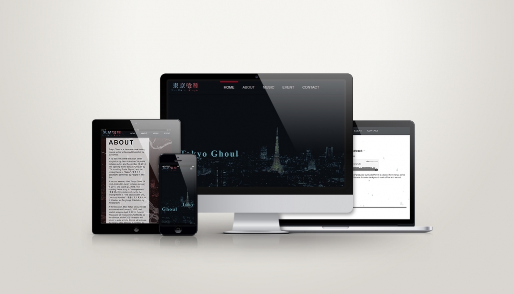
Both print and web design, I used the same elements such as Tokyo city, Blood and Debris to maintain a sense of continuity. I used 9 by 7 grids for a 4-fold booklet. I also made a carton for the CD tray to enhance the layering.
The website which I design is a single-page scroll layout. There are 5 sections in a page. It is responsive while users load the website by mobile or tablet the page components will scale down and rearrange to fit a smaller screen. The navigation also converts to the hamburger menu. Moreover, I wrote CSS3 transitions for the menu hover and add parallax effects for the glasses background.

Album art + Website – CD mockup

Album art + Website – Device mockup
The success of my CD packaging and website suite is it is able to deliver the atmosphere of this original soundtrack and it not only can grab attention but also trigger the purchasing desire of fans.
Next steps, I hope that I can learn more CSS3 animation and jQuery.
This post is one of my assignment from GDPW program at Humber College.
the original link:

 Yiwen
Yiwen Yiwen
Yiwen Yiwen
Yiwen
Leave a Reply
Want to join the discussion?Feel free to contribute!