Corporate Identity
Software: Illustrator, Photoshop
Milestone1: Logo Sketches
Design Brief
Company Name: Vital Energy Water
Product:
The nutrient-enhanced water that combines distilled water with vitamins, herbs and flavors. Also available with no calories.
Target market:
18-25 young people from all genders who love sports with medium income and live in urban areas.
The benefits of the product to the target market:
Replenish their body with certain nutrients that they lack. This may be especially important after exercising. It gives them a lower calorie option and can still enjoy a taste of sweetness.
What qualities/ products of the business support those benefits:
The ingredients contain Vitamin C, Pantothenic Acid, Niacin, Vitamin B6 and Vitamin B12. It provides a simple way to absorb nutrients.
Three businesses that compete directly with this business:
WILD – the letter i with a leaf accord with the meaning and showing nature.
Compete – Wild
BARRACUDOS – a sans-serif, bold typeface with a lightning symbol showing strong energy.

Compete – Activate
ACTIVATE – the logo consists of the cycling circle and two waterdrop symbols with different colour implying Circulatory system.
Compete – Barracudos
Creative considerations:
The new logo must be energetic, dynamic, fresh and health. This project should consider a simple way to convey the main element – water and vitamin.
The key message to be delivered by this design:
Start with water and a little extra nutrition to enhance health.
The current perception of the business:
Taking vitamins every day is a hassle. However, people can stay hydrated while enhancing the quality of water and drinking experience with the vitamins and electrolytes in the many flavors of vitamin water.
5 words that describe the tone and manner required of the logo design:
water, energy, health, refresh, low calorie
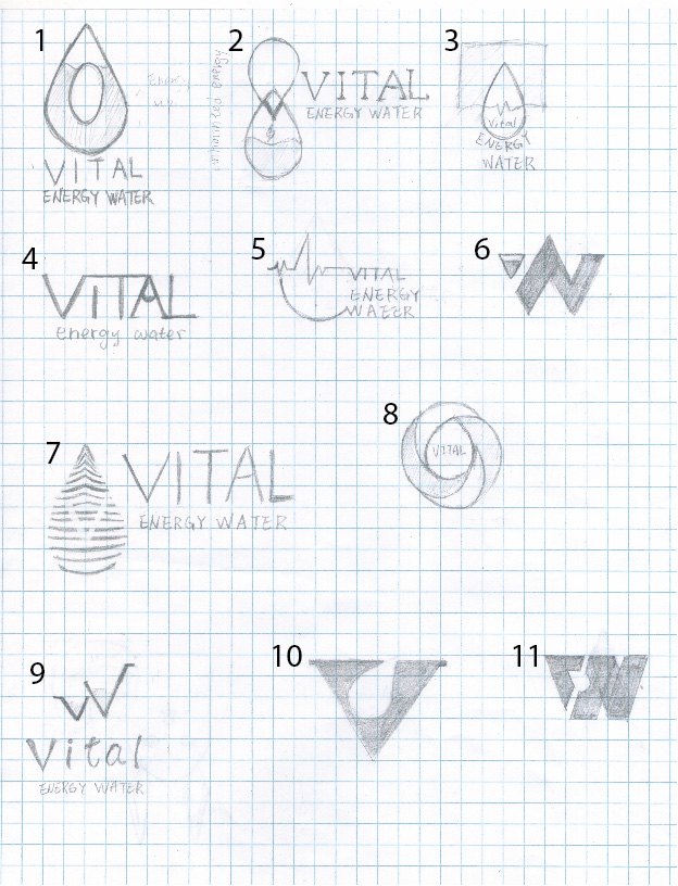
Corporate Identity – Logo sketch
Corporate Identity Milestone2: B&WLogo, Colour, Type
These are my Top 3 logos along with Colour and Type choices for the logo.
I wonder which typefaces better matches the logo. It is difficult for me to choose one.><
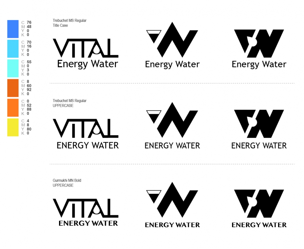
Corporate Identity – Logo B & W
Corporate Identity Final
To design a logo for a company is a long process. In the beginning, I felt nervous. I had no confidence if I could accomplish this assignment. After 3 weeks, I’ve done it!!! Just follow the step, hand out the milestone. I really appreciate all the help and suggestion from my instructor and peers.
In this assignment, I learned not only designing a logo but also printing knowledge. For instance, how to convert CMYK colour art to SPOT colour, how to avoid colour misregisters by trapping, how to save printing file prepress and how to trim a presentation folder. I enjoyed the process. Especially, when we did the printing mock-up, everybody helped each other.
I’m happy with the outcome!!
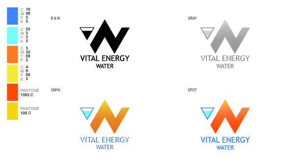
Corporate Identity – Logo
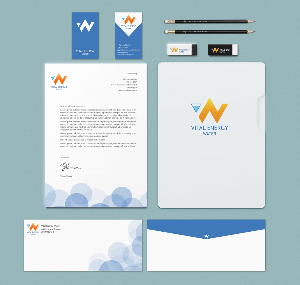
Corporate Identity – mockup Stationery
This post is one of my assignment from GDPW program at Humber College.
the original link:
Milestone1: Logo Sketches
Corporate Identity Milestone1: Logo Sketches
Milestone2: B&WLogo, Colour, Type, Stationery Sketches
Corporate Identity Milestone2: B&WLogo, Colour, Type, Stationery Sketches
Final
https://yiwen0128.wordpress.com/2018/05/31/corporate-identity-final/

 Yiwen
Yiwen Yiwen
Yiwen Yiwen Wang
Leave a Reply
Want to join the discussion?Feel free to contribute!